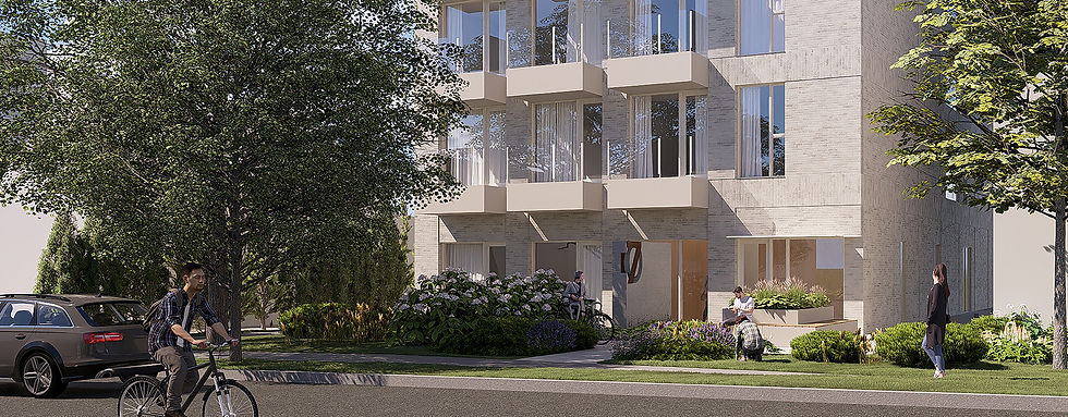
Spurline Developments: Amber & Oak
Brand Identity, Marketing Strategy, Web Design & Marketing Brochures
2025
-
Brand strategy & Brand identity
-
Content & creative development
-
User experience research & journey mapping
-
Website design
-
Signage
-
Brochure content & design production
Spurline Developments is a real estate development company based in Kitchener-Waterloo, committed to building spaces that elevate lifestyles, combining innovative design, integrity, and a commitment to creating lasting value for both residents and communities.
The challenge
Spurline Developments was introducing a new rental community in a desirable, fast-growing neighbourhood – and needed a brand that would appeal to today’s renters looking for more than just a place to live. The goal: create a brand that felt elevated yet welcoming, modern yet timeless, and aligned with Spurline’s commitment to quality, comfort, and community connection.
Our approach
The client came to us with a name, Amber & Oak, and a question: is this the right fit for the brand they want to build? We began by digging into the meaning behind the name, exploring its tone, symbolism, and alignment with the development’s values. Through competitive analysis, audience insight, and brand positioning strategy, we confirmed that Amber & Oak struck the right balance of warmth, strength, and timelessness – a strong foundation for a standout rental community.
With the confidence that the brand was the right one, we developed a full visual and verbal identity system that brought the name to life. The look and feel blended organic textures with clean, modern design. Messaging was crafted to speak to a sense of belonging, ease, and natural comfort – all qualities that matter deeply to today’s renters. Every element, from signage to marketing assets, was built to communicate a lifestyle rooted in thoughtful living.
The results
While the Amber & Oak development is still in its early stages, with construction set to begin in late 2025 and occupancy planned for 2027, the foundation has already been laid with a brand identity the client is proud to build on. The logo and visual system were met with enthusiasm and full alignment from the Spurline team, capturing the tone and vision they had for the project.
With a strong, strategic identity in place, Amber & Oak is now equipped with the clarity and creative tools needed to guide marketing, leasing, and community engagement as the project moves from blueprint to reality. We continue to support Spurline in the execution of their new Amber & Oak website.


